State Of Matter Anchor Chart: A Classroom Tool for Clear Understanding
Teachers of chemistry, physics, and general science know that visual aids can turn abstract concepts into concrete learning. A State Of Matter Anchor Chart does exactly that for the three (or more) phases of matter—solids, liquids, gases, and sometimes plasma. By summarizing key properties, particle arrangements, and common examples in a single, portable poster, the chart becomes a reference point that students can return to throughout a unit.
What Is an Anchor Chart?
An anchor chart is a large, teacher‑created visual that is displayed on a wall or bulletin board. It is built collaboratively, often while the class works through a lesson, so the content reflects the language and ideas the students generate. Once completed, the chart “anchors” the learning, providing a quick‑look guide for revision, discussion, or assessment.
Why a State Of Matter Anchor Chart Matters
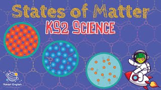
- Visual reinforcement: Particle theory diagrams help students picture how atoms or molecules behave in each state.
- Vocabulary hub: Terms such as melting point, evaporation, condensation, and sublimation are listed alongside definitions.
- Cross‑curricular links: The chart connects chemistry concepts with physics ideas like pressure and temperature.
- Study aid: Revision notes, flashcards, and quiz questions can be derived directly from the chart’s sections.
Core Sections of a State Of Matter Anchor Chart
When designing the chart, organize it into clear blocks. Below is a recommended layout that aligns with common curricula such as the BBC Science in Action series and FuseSchool resources.
- Particle Arrangement
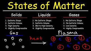
- Solids: tightly packed, fixed positions, vibrate in place.
- Liquids: close together but free to slide, giving fluids shape.
- Gases: far apart, move independently, fill any container.
- Plasma (optional): ionised gas, high energy, found in stars.
- Key Properties
- Definite shape and volume (solids)
- Definite volume, no fixed shape (liquids)
- No definite shape or volume (gases)
- Conducts electricity, emits light (plasma)
- Common Examples
- Solids – ice, metal, wood
- Liquids – water, juice,