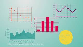
Understanding Science Graphing: Turning Data into Insight
In the realm of scientific inquiry, data collection is only the first step. To truly understand the relationship between variables, researchers and students must employ science graphing. Graphing transforms a raw list of numbers into a visual story, allowing scientists to identify patterns, trends, and anomalies that would otherwise remain hidden in a spreadsheet.
The Purpose of Graphing in Science
The primary goal of any scientific graph is to represent the relationship between two or more variables. Most science graphs focus on the interaction between an independent variable (the factor being changed) and a dependent variable (the factor being measured). By plotting these points, researchers can determine if a correlation exists and whether that correlation suggests a causal relationship.
Students learn the basics of these concepts early in their academic careers to ensure they can communicate their findings accurately. Whether it is tracking plant growth over time or measuring the velocity of a falling object, the graph serves as the evidence for the scientific conclusion.
Common Types of Science Graphs
Depending on the type of data collected, different graphing methods are required. Choosing the wrong format can lead to a misinterpretation of the results.
- Line Graphs: Used primarily to show change over time or a continuous relationship between two variables.
- Bar Graphs: Ideal for comparing different groups or categories.
- Scatter Plots: Used to determine the correlation between two variables, often used in the initial stages of data analysis to see if a trend exists.
- Pie Charts: Useful for showing parts of a whole or percentage distributions.
Characteristics of a High-Quality Line Graph
Because line graphs are the gold standard for showing trends in physics and chemistry, it is essential to understand the characteristics of a good line graph. A professional scientific graph should include the following elements:
- Clear Titles: The title should explicitly state what the graph is measuring (e.g., "The Effect of Temperature on Enzyme Activity").
- Labeled Axes: Both the x-axis (horizontal) and y-axis (vertical) must be labeled with the variable name and the unit of measurement (e.g., Time in seconds, Temperature in Celsius).
- Consistent Scaling: The increments on the axes must be equal. For example, if the x-axis jumps from 0 to 5, the next mark must be 10, not 7.
- Accurate Data Points: Points should be plotted precisely according to the collected data.
- Trend Lines: A "line of best fit" is often used in science graphing rather than connecting dots "zig-zag" style. This line smooths out experimental error to show the overall trend.
How to Interpret Scientific Data
Creating the graph is only half the battle; the more critical skill is interpretation. Biology professors and science educators often emphasize that a graph is a tool for questioning. When interpreting a graph, consider the following:
Positive Correlation: As the independent variable increases, the dependent variable also increases (the line slopes upward).
Negative Correlation: As the independent variable increases, the dependent variable decreases (the line slopes downward).
No Correlation: The data points are scattered randomly, suggesting no relationship between the variables.
For those looking for deeper insights, educational resources and worked examples of plotting data can provide a step-by-step guide on how to move from a data table to a finished visual representation.
Tips for Improving Your Graphing Skills
To master science graphing, practice is essential. Start by taking a simple set of data and attempting to plot it manually before moving to software like Excel or Google Sheets. When using software, ensure that you do not let the program choose the scale for you, as this can sometimes distort the visual perception of the data.
Always double-check your units. A common mistake in