What Are Graphing Unit Rates?
Graphing unit rates is a foundational skill in Pre-Algebra that helps students understand the relationship between two quantities expressed as ratios. A unit rate is a ratio that compares a quantity to one unit of another quantity, and when plotted on a coordinate plane, it reveals patterns that make problem-solving much easier. In this short math video we will find exactly how these graphs work and why they matter in everyday situations.
Whether you are comparing prices at the grocery store or calculating speed over time, understanding how to graph unit rates gives you a visual tool that makes abstract numbers concrete and easy to interpret.
Understanding the Basics of Unit Rates
Before diving into graphing, it is important to understand what a unit rate actually represents. A unit rate tells you how much of one thing corresponds to one unit of something else. For example, if a car travels 120 miles in 2 hours, the unit rate is 60 miles per hour. This means for every one hour of travel, the car covers 60 miles.
In this Pre-Algebra topic, you will often start with a ratio like 3 pizzas for $27 and need to find the cost of one pizza. Dividing both parts of the ratio by the denominator gives you the unit rate: $9 per pizza. Once you have that single-unit value, graphing becomes a straightforward process.
How to Graph a Unit Rate on a Coordinate Plane
Graphing a unit rate involves plotting points on a coordinate plane where the horizontal axis (x-axis) represents one quantity and the vertical axis (y-axis) represents the other. Here is a step-by-step approach to get it right every time:
- Identify your two quantities — Determine which variable goes on the x-axis and which belongs on the y-axis.
- Create a table of values — List several ordered pairs based on the given rate. For a unit rate of $4 per book, your points might include (1, 4), (2, 8), (3, 12), and so on.
- Plot the points — Place each ordered pair on the coordinate plane by moving along the x-axis first, then up or down along the y-axis.
- Draw the line — Connect the plotted points with a straight line that starts at the origin (0, 0). This is a key feature of unit rate graphs.
The Origin Point Matters
One distinguishing feature of a unit rate graph is that it always passes through the origin, the point (0, 0). This makes sense because if you have zero units of the first quantity, you must also have zero units of the second quantity. For instance, if you buy zero books at $4 each, you spend $0. The line passing through the origin confirms the relationship is proportional, which is always true for unit rates.
Using Slope to Interpret the Graph
The slope of the line in a unit rate graph is equal to the unit rate itself. When you calculate the rise over run between any two points on the line, the result will match your unit rate. Hey everyone in this video we're going to talk about finding the slope and seeing how it directly represents the rate in simplest form.
For example, consider a graph showing a distance of 150 kilometers traveled in 3 hours. The unit rate is 50 kilometers per hour. If you pick two points on the graph such as (1, 50) and (3, 150), the slope calculation gives you (150 minus 50) divided by (3 minus 1), which equals 50. The slope and the unit rate are the same number. This connection between algebra and geometry is one of the most powerful ideas you will encounter in this unit.
Real-World Applications of Graphing Unit Rates
Unit rate graphs appear in many real-world scenarios. Learning how to read and create them prepares you for everything from science experiments to personal finance decisions. Some common examples include:
- Speed and distance — Comparing how far different vehicles travel over the same amount of time.
- Shopping and pricing — Figuring out the best deal by comparing unit costs across different package sizes.
- Recipes and cooking — Adjusting ingredient amounts when scaling a recipe up or down.
- Pace and fitness — Tracking running pace by measuring distance covered per minute.
So in the next few problems you're going to be asked to look at different rates to see how they are doing on things like fuel efficiency, hourly wages, and production output. Being able to visualize these relationships on a graph helps you spot trends and make quick comparisons.
Tips for Mastering This Topic
Use these strategies to build confidence with graphing unit rates as you progress through your Pre-Algebra class:
- Practice converting ratios to unit rates first — Make sure you can reduce any ratio to a unit rate before attempting to graph it.
- Always label your axes — Writing clear labels prevents confusion and helps others read your graph correctly.
- Check that your line hits the origin — If it does not, review your calculations for errors.
- Verify using the slope formula — Pick two points on your line and confirm the slope matches your unit rate.
- Use graph paper or digital tools — Accurate plotting makes it easier to see the proportional relationship clearly.
4.3 Find Unit Rate from a Graph
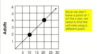
Just as important as graphing a unit rate is working backward from a graph to find the rate itself. Learn how to identify two clean points on the line, calculate the slope between them, and express the result as a simplified unit rate. This reverse process reinforces your understanding and is frequently tested on exams.
The ability to move fluently between tables, equations, and graphs is a hallmark of mathematical proficiency. By mastering graphing unit rates, you are building a skill set that will serve you well in Algebra, Geometry, and beyond.
```